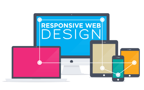
Mobile Website Design
With the increasing adoption of smartphones and tablets all across the globe, demand for multiple device compatible websites has reached its peak. A responsive Web design not only maintains and normalizes the same look and feel for a website irrespective of devices, it also take care of factors such as click versus touch, screen size, pixel resolution, support for Adobe’s Flash technology, optimized mark-up and several others. The formation of layout, subsequent coding and the final visual presentation is done in such a way that the responsive development provides the optimal viewing experience to any viewer for any website in any device. But, not only a responsive Web design enhances the viewing experience but it also takes care of SEO, which is the central element of any digital marketing strategy.
Make it easy for people to contact you. By using mobile features such as call buttons and easy access contact forms you are more likely to increase sales conversions. We all dislike having to copy and paste a phone number to our phone dialing screen. This makes it easy. Just click and call!
Retina Ready
High definition images that are stunning to your website visitors and most importantly compatible with Apple’s Retina displays!